5 Job Application Mistakes Architecture Students Keep Making

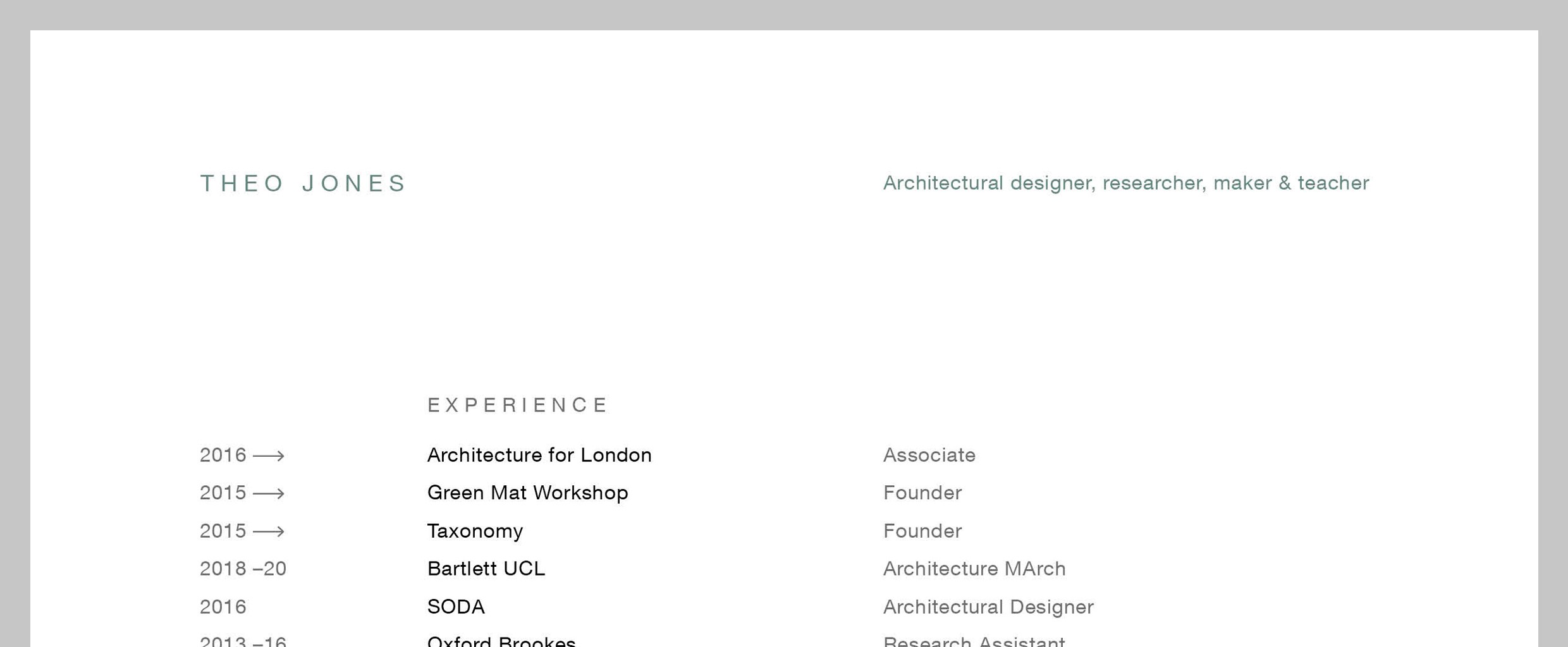
Hello, I'm Theo Jones from Green Mat Workshop and part of the hiring team at Architecture for London. I review hundreds of applications each year, so I hope my employer-side insight can assist you with your upcoming job search.

Green Mat Workshop offers architecture courses and tutorials in everything from design and software to model-making and portfolio crafting. Here are the top 5 mistakes I see architecture students making when submitting their CVs and portfolios.
Calling or emailing to enquire about job vacancies
We've all browsed an architect's website, admired their work, but found no explicit indication that they're recruiting. At my practice, we get numerous well-meaning individuals calling us. We usually respond by asking them to send their CV and portfolio via email, other firms might respond yes or no.
Suppose you phoned on Monday, received a negative response, and therefore didn't send an email. Then on Wednesday, someone hands in their notice, and suddenly they're recruiting! Had you emailed without the fuss of a phone call, you could've been first in line for the job.
You'll never be aware of a company's internal situation, but you should always send that email!
Generic cover letters
A cover letter is your opportunity to discuss the firm you're applying to. Numerous cover letters are generic and merely talk about the applicant. As a rule of thumb, I advise a balance of 50% you, 50% them.
An easy way to help your cover letter stand out is to spend a little time studying a completed project on their website, what do you like about it? Has it won an award or been published? Further than this, what values does the company have, show that you share those ambitions or goals.
Your cover letter might not be read during the initial review of your application. More often than not, the portfolio or CV is the first document reviewed. To prevent important content in your cover letter from being overlooked, incorporate some of it into the body of the email.
So, attach a PDF cover letter and include a version of it in the email itself.
Using Dropbox or Google Drive
The harsh reality is, no one wants to click on links leading to document-sharing websites, Issuu or your personal website. They simply want to quickly open the attached PDF portfolio. They might even wish to save it to their internal server for a colleague to review.
If your reliance on these websites is due to large file sizes, then take note of mistake 4.
If you have a nice website, fantastic, include it in your email signature, but it's of secondary importance.
Sending your complete portfolio

As university students, we generate epic portfolios showcasing our comprehensive projects. However, an academic portfolio isn't suitable for job-seeking emails. Your emailed portfolio should be a teaser. For part 1s I recommend 8 or fewer pages, for part 2 and early-career architects, a maximum of 15. Less truly is more!
Showcase a range of skills but lean towards your best work. Oh, and omit the 'A Level art page'!
Create multiple versions of your CV and portfolio so that you are prepared for all requirements. Your sample portfolio is just a taster of your work so don’t feel like you have to include detailed information about projects like site context or research, simply focus on the most eye-catching images.
Double-spread portfolios
We all love InDesign, right? Maybe love is a strong word, but we all ought to be using it for our portfolios. The default workspace in InDesign is for creating a physical printed book, complete with front and back covers. Due to this, InDesign creates double spreads (facing pages). This results in an awkward digital book upon export.
The double spreads mean that each page, when viewed on a screen, appears smaller, causing your work to be less visible. Instead, keep it simple with single pages in A3 landscape format.
We have a number of free resources to help with portfolio design over at Green Mat Workshop. Best of luck with your search!

