5 Adobe InDesign Skills Every Architecture Student Must Know

What is InDesign?
Adobe InDesign is a document publishing tool, part of the Adobe Suite, it lets you create documents that you can publish online as well as set up for printing. What sets it apart from software’s such as Illustrator or Photoshop is that its sole purpose is for composition.
We’re going to learn about the basic features of Adobe InDesign and some key tips that will help you in the long run creating any kind of document. Architecture is a type of subject where you need to manage your time carefully and sensibly. Saving time can make a lot of the difference.
You might have already heard about studio culture that involves staying up all night to complete your work or finish those drawings, but it's a thing of the past. Software like Adobe InDesign are made to help up for these tasks and actually better our work. It's all well and good having great work but the quality of your work can depend on its presentation. After all, designers are visual thinkers.
Composition, page layout and other small things like text or colours might seem like an afterthought and rightfully won't be a priority on your list. But setting up habits early on can definitely help you later on in life with any kind of task. This article isn't a full guide, there are plenty of those out there that we think are great. This article is just showing you the absolute key and important tools that we think students will benefit from. It's a step in the right direction to get you going.
Document Set Up
When you first open Adobe InDesign, the first thing you need to do is create a new document and although it can be easy to click ‘Create’ without giving a thought to your document properties, this is really where the tutorial begins.
In this example, we’re going to create a small portfolio of around 10 A4 Pages that are portrait. Make sure to name your document as well.
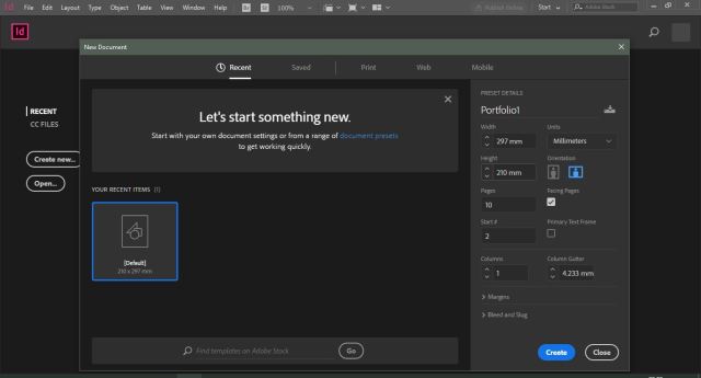
I’ve turned facing pages on for this instance. It lets you see the document as if it were a book. This will come handy later on for double-spread pages and threading texts across one or more pages.
Don’t worry at this point if you feel like you might not stick to these options because you can always add pages or edit these parameters.
To do this you can go to File > Document Set Up (Ctrl +Alt + P).
For printing purposes, usually a 3mm bleed is necessary. You can also choose to have this in your document and make sure your artwork goes beyond these dimensions to avoid white borders.
Master Pages
Master pages. Probably haven’t heard that since using Microsoft PowerPoint? But we’re sure you must have some idea of what a master page does. If not, then to cut it short, a master page is sort of a live template for your document.
Usually you can use the master page for formatting and adding template boxes or to mark out specific areas of a page where you want a certain text, image or colour to be.
This page doesn’t count as a final page in your document and therefore doesn’t interfere with publishing and printing. You can essentially create your own headers, footers and other standard details on these pages that will update accordingly in your InDesign document.
Adobe has its own tutorial on using master pages: https://helpx.adobe.com/uk/indesign/using/master-pages.html
But I bet you prefer our short version. To get started, in your right toolbar click on the Pages panel. If you can’t see this yet, go to Window > Pages (F12) to show the panel. At the top you can see the options for ‘None’ and ‘A-Master’. Double click on ‘A-Master’.
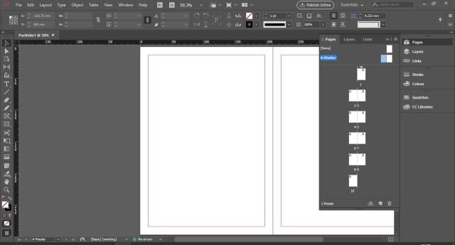
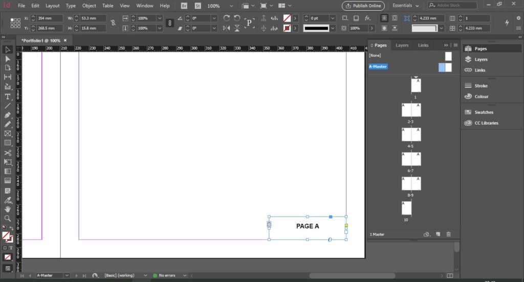
Now we can add our features. Let’s start off by adding page numbers. Using the Type Tool (T) click and drag to create a textbox.
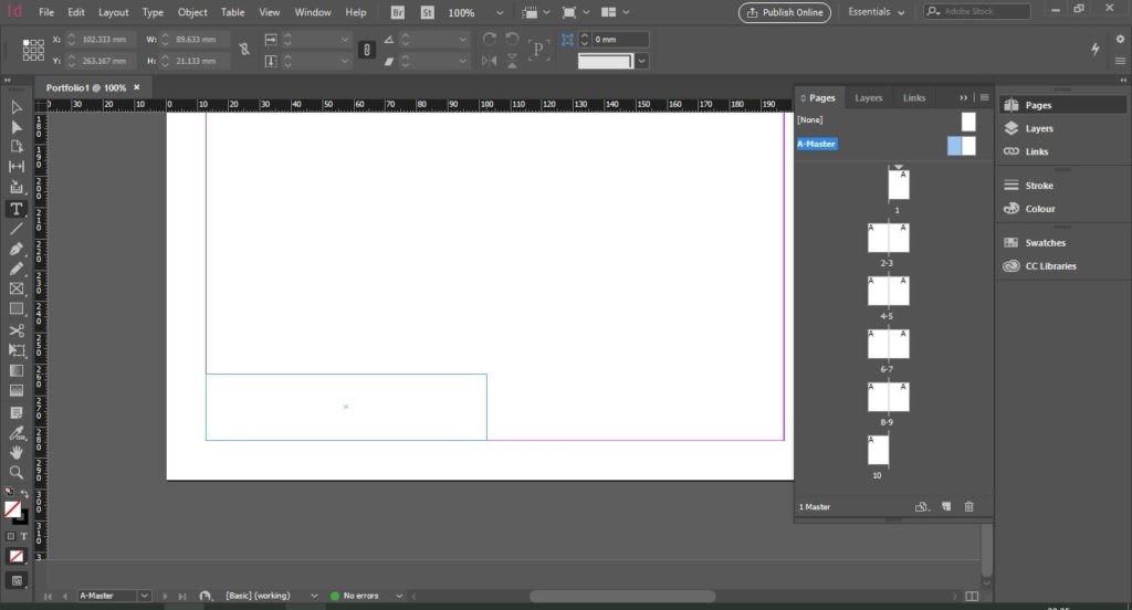
Now, whilst inside the text box, Right-Click and selectInsert Special Characters > Markers > Current Page Number.
This will automatically add the letter ‘A’ to the page. Youcan edit this to add any text before or after the A such as ‘page A’ or ‘0A’.
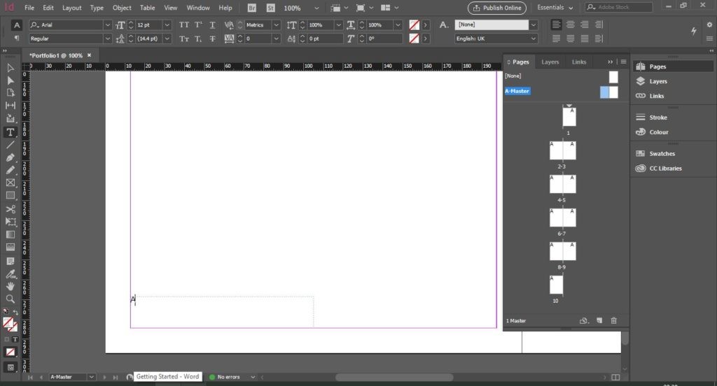
Now we can copy this to the other page by using Ctrl + C > Ctrl + V and position it in the same way.
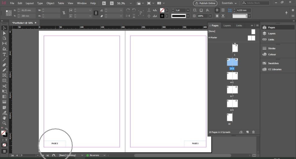
If we go back to our document pages by Double-Clicking onthe first page, we can see the outcome of our master pages.
Now, we want to add a specific frame for our logo, but perhapswe don’t want this on every page. Go back to the master page. On the right page,in the upper-left-hand corner use the Rectangle Frame Tool (F) to draw a box where we want the logo to go.
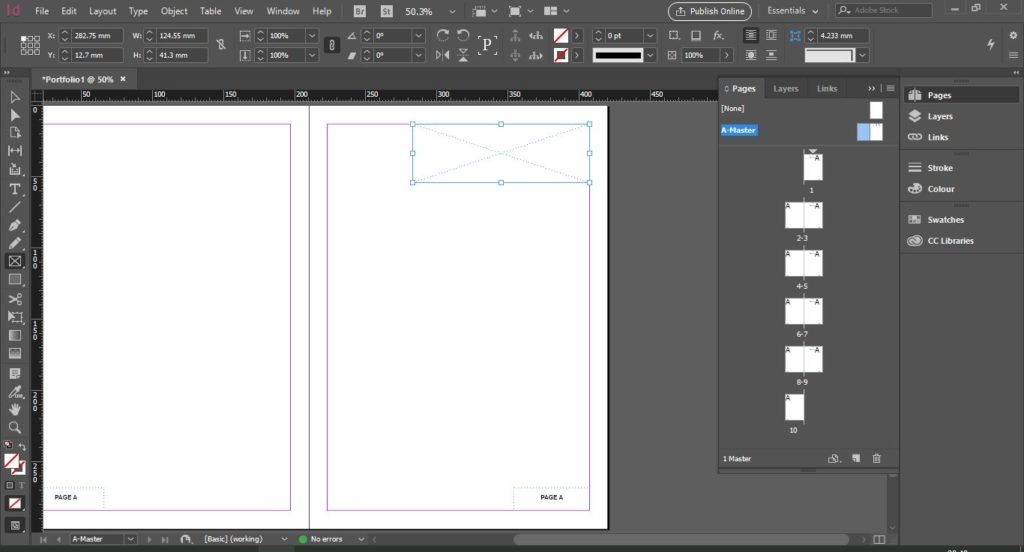
Earlier, the text box was only specific for text details whereas the frame tool allows you to create an area for text, images etc.
By Single-Clicking you can also set the dimensions of said box.
Now we are going to place our logo, or any image by going to File> Place. We can then adjust this to fit the frame box. To learn moreabout images in Adobe InDesign, read ahead in our Images section.
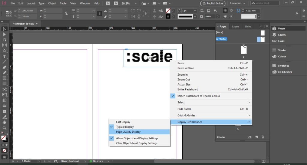
If the image is blurry, you can Right-click > Display Performance > High Quality to get it back to a high quality. InDesign does this so that pages don’t take a long time to load and it doesn’t make InDesign slower.
But we don’t want this to appear on the 5th page for example. To not apply it to that particular page, drag the ‘None’ page onto the 5th page. Then Double-Click to see the difference.
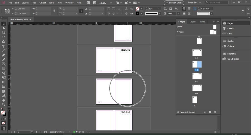
There are many more options and features of the master pages that we will break down in a future post.
Images
Images should ideally be edited in whichever way needed before bringing it into InDesign. As it is not a photo-editing software, it isharder to apply any effects to photos in this software. These can be imported as their .psd and .ai files respectively so that it can update as changes are made.
To add an image to the document, go to File > Place and select your image. Here I’ve placed one and turned on the High-Quality Display Performance.
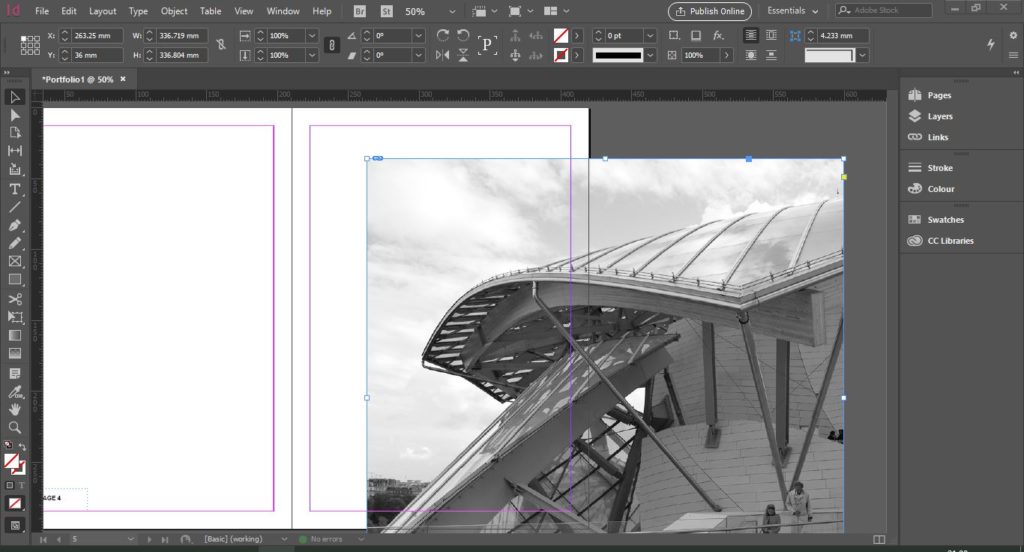
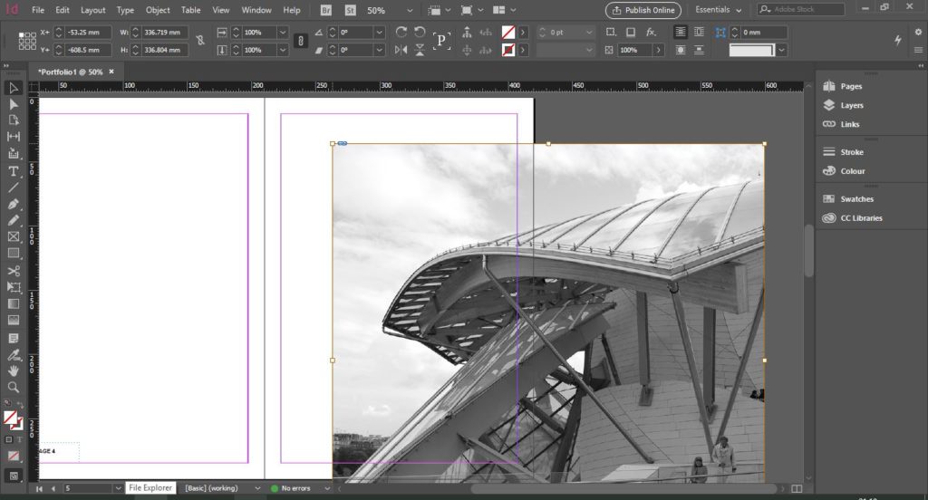
But my image is too big and if I try to use the anchor points it seems to crop the image. To affect the size of the image directly you willneed to Double-Click on the image so that it shows the brown outline.
Now holding the Shift key and dragging, we can change the size. Then, Double-Click the corner points of the blue box to adjust this as well.
Another way to do this is to use the Scale features in the top toolbar. This adjusts the size by percentage and is really the quickest way of making an image smaller or bigger. Make sure the Constrain Proportions lock is ON.
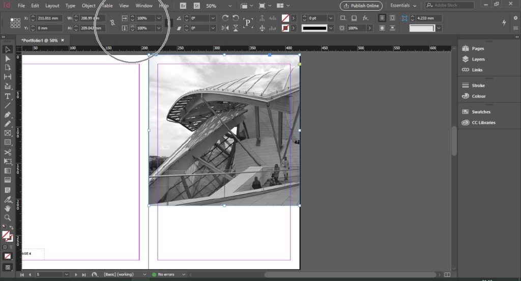
Those are the basic features of adding an image in Adobe InDesign.
Swatches
Swatches can be an overlooked feature of the Adobe Suite overall. We used this in Illustrator and Photoshop (check out our articles HERE). Swatches let you keep a record of the colours you use within your document.
This can be extremely vital when creating long documents that have a colour scheme or theme. It helps manage the number of colours you use so that your document doesn’t look unorganised and so you don’t end up with different versions and shades of the ‘same’ colour.
For example, for an architecture portfolio or design project,we suggest keeping the colour scheme minimal, yet unique to you. Having too much colour can distract from the actual work and drawings, and eventually gets hard to keep up with. On the other hand, keeping it too minimal may come across as boring and plain. With a palette of colours, you can use it in different scenarios. Adding a key or legend to diagrams, having subheadings or even using them in your final images to pull it all together.
Creating a swatch isn’t hard and you can do this from scratch or download a swatch online. We like to use Adobe Colour: https://color.adobe.com/explore.
Perhaps 4 or 5 colours might be too much for an architectural project, so we recommend sticking to 3. Black should be your main text colour; another colour can be your accent colour and a neutral tone for other diagrams or shapes. This makes everything look much more cohesive and can actually help to understand the whole project as one.
For this example, we’re going to show you how to add colours to swatches and turn it into a group. First open the Swatches Panel bygoing to Window > Swatches.
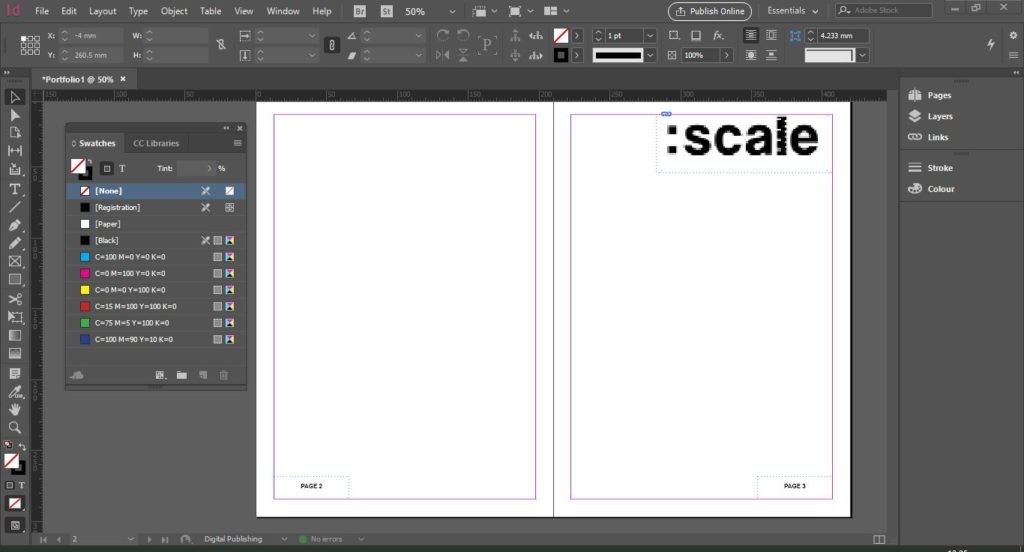
Next, we’re going to create a shape with a teal colour. At the bottom of the Swatches panel, click on the New Swatch button to addit as a swatch.
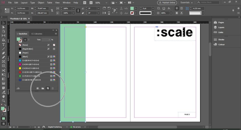
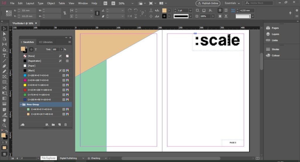
Add another shape of a different colour. Now click on one swatch and hold the Shift key and click on the other swatch. Now, both should be selected.

Next, click on New Colour Group, the icon next to New Swatch. Now we’ve made a specialist group for our swatches. You can have as many swatches as you want in your document.
Text Options
Typography is essential for graphic design of any sort. You could say it’s a key pillar. Text is something you can explore better in Adobe InDesign compared to Adobe Illustrator or Photoshop. The following are small tips and tricks that can make designing easier.
Text threading is when you have multiple text boxes and you want your large text to carry on to the next text box. It can be a long process to edit your text or repeatedly copy and paste chunks into their own text boxes, so this method allows for easier editing.
Let’s say you have text you are going to copy in from your text document. First, create a text box the rough dimensions you want on one page.
Go to the Type Tool (T) on the left toolbar and Click and Drag to create a text box. Then, select the text box using the SelectionTool (V) and Copy (Ctrl + C) > Paste (Ctrl + V) and move the second text box to the other page.
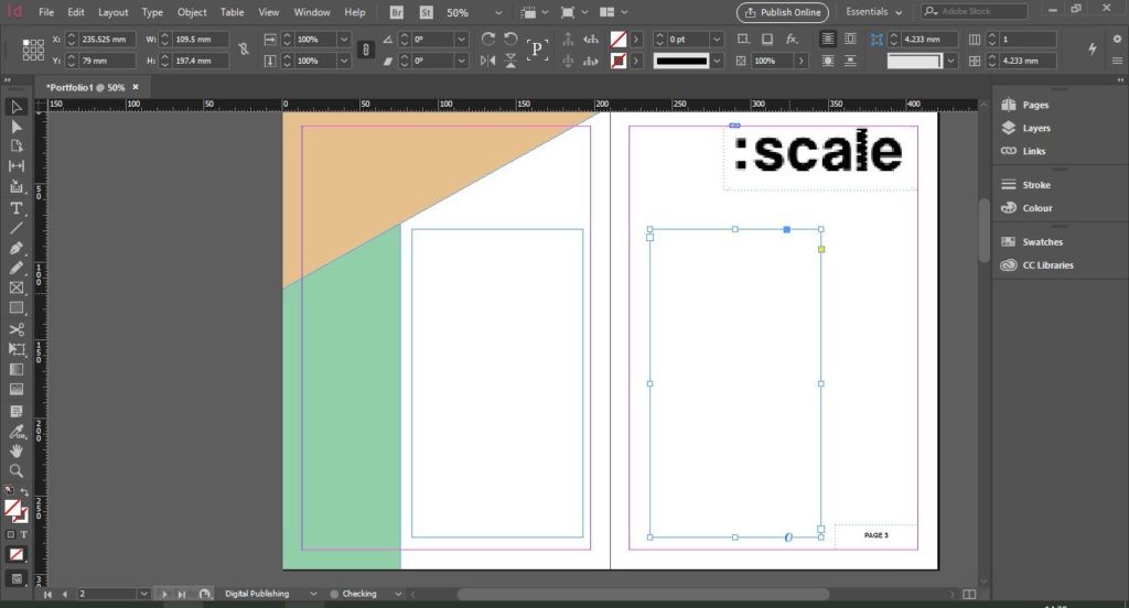
To position the text boxes evenly, make sure Smart Guides are turned on. You can do this by going to View > Grids and Guides > SmartGuides (Ctrl + U).
Now, Double-Click inside your first text box and Paste(Ctrl + V) your text in. We’ve pasted in some filler text. As you can see, at the bottom of the text box, there is a Red Plus Icon. This means the text does not fit inside the text box.
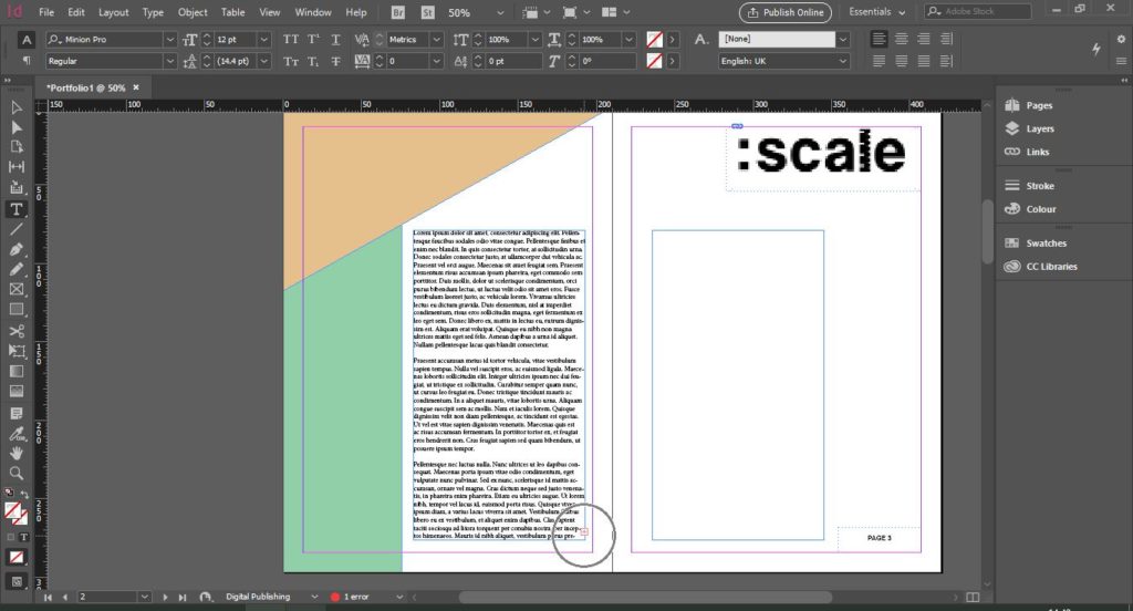
To carry on the text to the other text box, use the Direct Selection Tool (V) and click on the Red Plus Icon. This gives you a short preview of your text. Then, click inside your other text box.
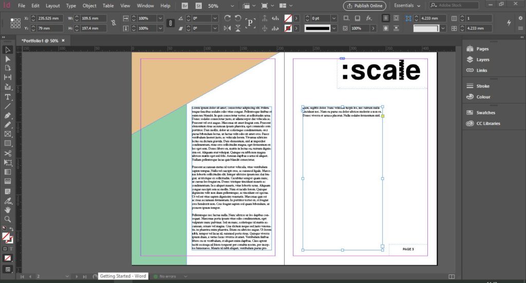
There isn’t much text carried forward so increase the font size to 14pt. You can select all the text by Clicking and Dragging over both text boxes.
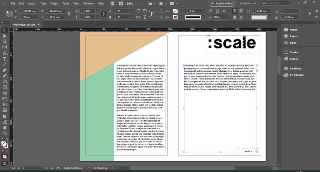
Now, if we change the size of either text box it will adjust the text accordingly.
Another annoying feature of Adobe InDesign can be the auto-hyphenate. To turn this off, go to Window > Type and Tools > Paragraph (Ctrl + Alt + T). This opens the Paragraph panel. Then, select all your text using the Direct Selection Tool (V) and uncheck the Hyphenate box.

To export your document, go to File > Export andselect the file type you want to export as.
Of course, there are plenty of other tools to learn in Adobe InDesign, but with these basics, you can get started on creating stunning documents. There are many more things you can do with Adobe InDesign. You have to see it as an organisational tool that will help you in the long run. You don't just need to create a portfolio in InDesign, it can also apply for small or big projects.
The other alternative would be to compile all your pages in Illustrator or Photoshop, which is fine but can make things seem a bit disjointed. A benefit of creating your projects in Adobe InDesign is that it makes the exporting process quite flexible.
The next article of this series is going to be focused on Adobe Photoshop. Probably one of the well-known ones out of the suite, we're going to show you the basic tools you might need and suggest some uses of the program that may not be so obvious.
As usual, we’ve linked below some resources we often go backto when using InDesign.

