Productivity
Jan 7, 2024


[responsivevoice_button rate="1" pitch="1" volume="0.8" voice="UK English Female" buttontext="Play"]
We’ve all seen realistic renders and imaginative illustrations, but do you really know how it all comes together? Most people really underestimate the process of such images and often, first or second year students might not even have an idea how to go about doing this. This tutorial is for creative simplistic, minimal yet sometimes stunning illustrations. Of course, we explain adding colour in detail, but you still have to understand that there are two major processes before and after this stage. You may need to have a decent model to begin with in a 3D modelling program like Rhino or Sketchup. After adding colour, there’s still a lot of post-production that you can work on.
If you’re really stuck, look for some inspirational images online. You can look at Pinterest or even Instagram. We’d suggest starting in your own university, look at works of those studying masters to understand the processes behind these types of images. You could even look at units who have websites or blogs and look through the archives and find one that appeals to you and your project. It can be the colour palette, composition or small details. Personally, I like printing them out and keeping it in front of me so it’s always in my mind. Best if you have a noticeboard or plain wall in front of your desk.

We’re using a 3D model as a base for this image and any other illustrations. This isn’t compulsory, but if you’re already modelling your building and are planning on using it for other purposes, it can be easier to do it this way. The other alternative is to come up with illustrations based simply off a sketch or your imagination. Usually these aren’t to scale so there aren’t any restrictions, but a model can help with overall measurements and figuring out the scales of walls or objects. If you’re here for just the adding colour part of the tutorial, skip ahead here.
At this point in the year, you should have a really solid 3D model or at least a part of your project that is decently and properly modelled. It can be a good idea to create a separate model just for your perspectives. We’ll tell you why. You don’t want to constantly be having to model things for no reason when it’s not going to be in view. So, your first step needs to be to clean up your model, save a new copy and then delete the parts you’re definitely not going to be working on.
We think this is most helpful if you have custom structuresor cladding that goes around the entire building. Try and not make the mistakeof overloading the model with imported objects. If you’re going for anillustrated look, you don’t actually need 3D modelled furniture, you can justadd it in post-production. Remember your image is about the architecture firstand the details just enhance the architecture and the project.
Keep things as simple as you can. If you have a scene or view in mind use a camera to play around till you get a good view. At this point we’d recommend you think about composition as well. Have a look at general architecture photography for real projects. You can even sketch out or clay-render different options. We often make the mistake of trying to fit as much in as possible and while this may be fine for an overhead view or axonometric projection, these kinds of images are giving a glimpse into your project and you will only have 3-4 of these in total so choose your scenes carefully.
Another thing to consider is the presentation of the image.Is your projection portrait or landscape and if either, think about why? Tryand have a focal point of the image and show some kind of depth if possible.Usually during painting or photography, you think about a foreground,middle-ground and background so try and sketch this out and try a couple ofdifferent compositions. You might be able to change the composition later on,but it depends on your model.
After you’ve set a scene for your image, we would suggestdoing a couple of test renders using the basic rendering engine on yoursoftware and then exporting line drawings to see what needs to be fixed orchanged. This process can be the toughest bit for those starting out so don’tworry, just plan ahead of time! If you’re going to be creating 3-4 final imagesand they’re all illustrations, set out 2-3 weeks of time, leaving an extra weekfor portfolio final touches.

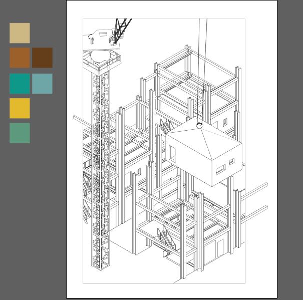
The line drawing is probably the most important part of this tutorial, it needs to be immaculate, trust us. If you have any gaps, awkward or missing lines, it’s just going to make the process 10 times longer later on – we’re talking from experience and frustration. Depending on your software, you need to work out whether the line drawings are clear and easy to work with. Our recommendation is to use the version of Sketchup that lets you export a line drawing as a pdf or DWG file. Sketchup is also easy to use for shadows and depth of field. The type of file to export is up to you but we’d suggest either AutoCAD or Illustrator, whichever one you’re more comfortable with, but we’ll tell you the differences later. You could also sketch in parts in Photoshop if you have access to a drawing tablet.
If you haven’t already exported or imported your model intoa software where you can then export a line drawing from, do it. Then, thinkabout the shadows. In Sketchup you can play around with this quite easily. Itmight be a good idea to note down the type of day or consider the location ofthe project to get a better understanding of this. If your project comes aliveduring the night, you don’t need to think about every single shadow, maybe justones that are obvious. On the other hand, if your final image is during theday, think about the orientation of your building and where the sunlight willbe coming from. Lastly, export just a shadow layer as a png. If you don’t knowhow to do this, we’d suggest this video that explains it perfectly.
https://www.youtube.com/watch?v=wAI9UUBT-zk
OU Graphics
An organisation tip at this point is to create a folderspecific to this one image. You’ll find you’ll end up with not just the model,but several iterations of exports that you’ve tried, and then other things sojust keep it all in one place for easy access.

After exporting the saved scene as a line drawing, you need to go over and check it for any missing or extra lines. The hidden line feature in Sketchup sometimes misses over objects that haven’t been classified as a 3D object such as lines. From experience, AutoCAD is much easier and quicker than Illustrator, but both do the job in the end. The reason for this is that the ‘trim’ tool in AutoCAD makes life so much easier because you can get rid of lines efficiently. Here, you can also set up the page view. For example, in the image below, there were some elements that stuck out of the ‘border’ which made it seem a bit more 3D and gave it an edge.
Essentially, just go over every area of the line drawing.Highlighting the lines in AutoCAD works great. This is because when you tryusing the live paint function, you need closed shapes so that the coloursaren’t spreading everywhere. It’s also good to mention, if you prefer usingPhotoshop directly to add colour and want to see a tutorial, tell us in thecomments below. Once you’re happy, you can keep it as a dwg and import to AdobeIllustrator or save the line drawing as a pdf. Save an extra copy just in case.You can use this later on for other purposes.
Before you get started, open up the line drawing in AdobeIllustrator and check your page sizes and set the document colour mode to CMYK.Then, bring out that inspiration image and have a look at the colours used. Arethey warm or cool tones? It is extremely bright or muted down? Then, thinkabout the colours you want to use. You might already be imagining somethingalready, but it can be a good idea to take a break and look through a few morepictures. The colours aren’t set in stone, you can change them in Illustratorand also using adjustment layers in Photoshop.
If you need some ideas, have a look at our Pinterest board for Perspective References. There’s no right or wrong way of doing things, it’s just a means of helping you start. If you have your own idea, go for it.

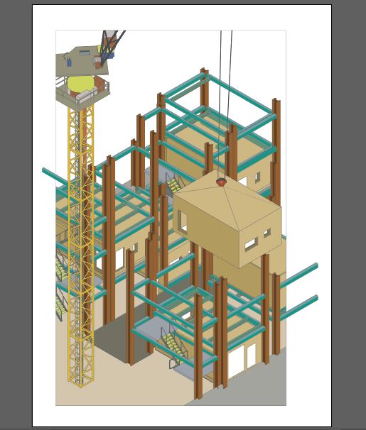
First, set out your core colours off to one side. Draw outsmall squares with the Rectangle Tool (M) and create a palette that’s visibleon your workspace. You can also create swatches and palettes from this if youwant to re-use it for something else. This will make your life so much easierwhen you’re live painting in each section. The best method would be to startwith one colour and go and fill it throughout the entire image. Yes, you maymiss spots or have to go back and change a few things, but it creates a workflowthat is way better than having to go back and change colours each time.
Then, select your linework, and head to Object > Live Paint> Make. Click on one of your swatch squares using the Eyedropper Tool(I) and then the Live Paint Bucket Tool (K) and start painting.
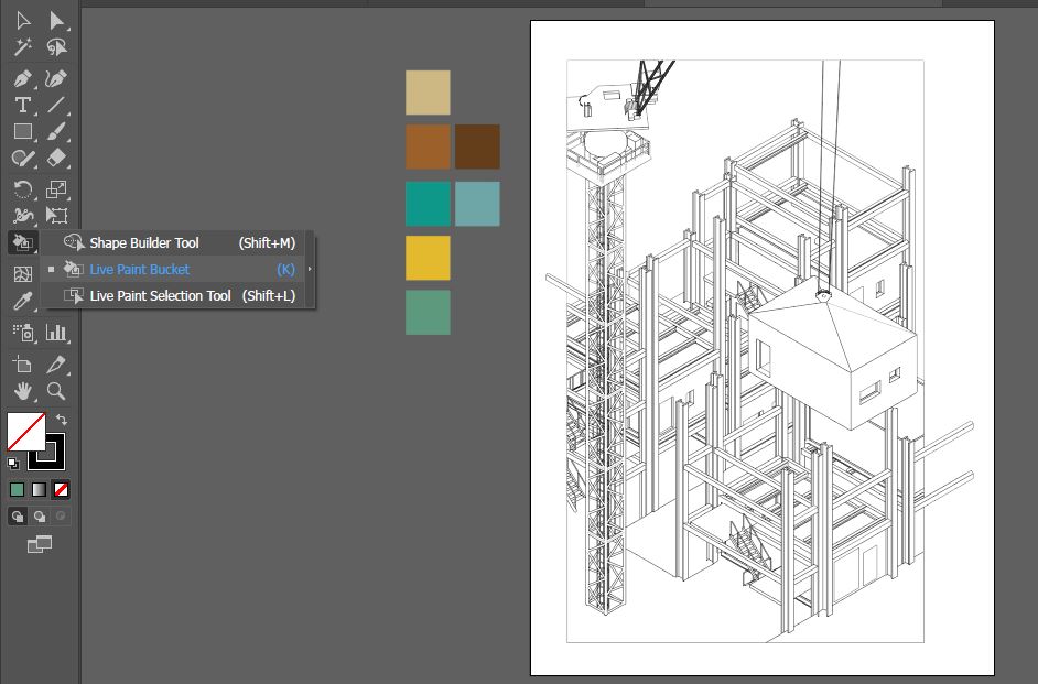


Your hard work of checking the line drawing comes into playright now. The areas highlighted with a red border are the paintable areas. If youdon’t see the border or if it groups together two shapes this means there issomething wrong with the line work. In Adobe Illustrator, you can fix this byclosing the line using the Direct Selection Tool (A). You don’t necessarilyneed to ‘add’ or draw in a new line, just extend the line or make it smaller sothat it connects with another line and creates a closed shape.

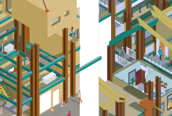
This process can take a long time depending on how much detail there is in your drawing and the amount of colours you’re going to be using. Remember to SAVE your work every now and then. I like to set reminders every half hour on my phone so that in case of errors, I don’t lose the entire colouring process. Illustrator may act up or lag in these cases so try and not have any other big programs running in the background. Once you’re done, you will reach a fully coloured stage. In this example, I’ve left out the background where the sky would be and the insides of the apartments because this is part of my post-production.
If you’re not happy with the colours and want to drasticallychange it in the entire image, you can select one area with that colour, then goto Select > Same > Fill Colour. This will select all the areaswith that colour and then you can change it using your colour picker. If youwould prefer to lighten or darken the image, we would suggest leaving it to Photoshopwhere you can tweak these easier.
To import your work into Photoshop, you can easily do thisas an Illustrator file so there is no need to export into different formats. Tofinish this drawing, it needs a sky, shadows, textures and people. At the endof this tutorial, you’ll find the final image.
Now the long bit is over, relax and take a breather. Thencome back and keep going! The post-production part of this tutorial is up toyou as a designer and the style you’re actually going for. You’ve got the hardpart done by adding colour. In Photoshop, if you’re using the coloured image asyour base layer, you can very easily create masks and select different areaswhich is exactly what you want. Now, your options are to add some texture oroverlay effects and even add people. We’ll explain briefly how to do it below,but we will be creating tutorials on this later so don’t worry.
If you’re raring to go or just want to get an idea of what post-production is, have a look at the tutorials below. We love tutorials by OU Graphics and Show it Better, they’re explained well and aren’t hours long. Once you understand how it’s done, you can repeat the steps yourself – don’t fret if it takes longer on the first try.
https://www.youtube.com/watch?v=csxHZrQTz9w
Show it Better
https://www.youtube.com/watch?v=1tBTDbEYMOw
OU Graphics
Also remember, the level of realism is up to you. If you’re focused on presenting something abstract and extremely minimal, you can stop at the previous step and move on to your next task. Obviously, the amount of work you put in will give different kinds of results so take this into account. The time spent on each image also should be taken into consideration so that you’re not spending too much time on one image. Usually, after you do the first one, you’ve understood the method and then as you progress, it’ll be faster.
At this point, add in your shadows and remember to use a layer mask to get rid of or add in shadows. You can use a soft Brush to paint in the shadows if you’re going for a softer look. Decrease the Opacity and make use of the different blending modes like ‘multiply’ or ‘soft light’ and see which works best in this case. Sometimes, you might have to re-size the shadow because it’s been through a couple of programs so our tip would be to find a straight edge of something you can clearly see in both your line drawing and your shadow image and match it via that.
Adding even one simple overlay texture can make all the difference to your image. It just gives a natural looking element that isn’t there when you’re just adding colour to something. To get rid of the flat look, just add in a paper texture. You can do this by finding a high-quality image of a paper such as watercolour paper, then add it in to your image as a new layer. After that, you want to go and set the layer to ‘multiply’ and then play around with the opacity so that it looks natural. Then, you can see the difference it makes. For images with a softer and lighter colour palette, this one step makes it even more beautiful.
To add areas to specific areas, we would definitely tell you to use Layer Masks. If you’re not familiar, have a look at this tutorial below by PHLEARN. He explains layer masks very simple and you can play around with the feature to get comfortable using it in your own work. This is important because it means you’re working in a non-destructive way. You don’t want to be accidentally erasing or painting over your base layer and then having to replace it. Plus, working with multiple layers can get confusing if you don’t label or group them properly. It’s better to get in the habit now, than being confused while you’re almost done but become stuck.
https://www.youtube.com/watch?v=h5yW5hHjQrE&t=845s
Other textures might include wood, metal, leather, anything that is present in your line drawing that could use a texture. Again, make sure you’re using high-quality images. Plants and grass might be easier to add at this stage. If you don’t want to use a realistic plant – which some people do – you can open it in Illustrator and use the Image Trace function to create a vector out of it. This keeps the plant proportions and colours and you can get an illustrated effect instantly. If you want to learn how to do this, check out our ‘Adding People’ tutorial.
For post-production, lighting is a core part of the process.You don’t need to go crazy with this. Below is an example of a tutorial by OUGraphics on adding light in your images. Some soft light can be quickly addedusing the brush but if you have a night-time scene you might want to go for aneon light situation, in which case you can have a look at the tutorial below.
https://www.youtube.com/watch?v=YcGlkGCYaSM
Don’t forget to add some life to your drawing! Whether it’s interior or exterior images, adding people doesn’t have to be difficult or a chore. If you struggle way too much or don’t have any time, maybe consider leaving it out.
Adding colour to your architectural drawings and perspectives doesn’t need to be overly complicated. It requires a lot of time, effort and patience. If you’re willing to give your best in order to achieve the results you want, you will surely be able to do it. Just remember that the ‘adding colour’ bit is part of a larger process overall that we’ll be breaking down in the coming weeks. Have a look at the final result below. If there is anything specific you want to learn how to do or have questions, let us know on Instagram or join our Discord chat where we encourage members of our community to share tips and ask for help.
